Closed Exhibition – Sky Arts Ignition: Memory Palace
Sky Arts Ignition: Memory Palace - About the Exhibition
18 June – 20 October 2013

Sky Arts Ignition: Memory Palace brought together a new work of fiction by the author Hari Kunzru with 20 original commissions from leading graphic designers, illustrators and typographers to create a multidimensional story.
The way we read books is changing. Memory Palace explored how a story might be imagined in a different format – as a walk-in book.
The Story
Hari Kunzru's story is set in a future London, hundreds of years after the world’s information infrastructure was wiped out by an immense magnetic storm. Technology and knowledge have been lost, and a dark age prevails. Nature has taken over the ruins of the old city and power has been seized by a group who enforce a life of extreme simplicity on all citizens. Recording, writing, collecting and art are outlawed.
The narrator of the story is in prison. He is accused of being a member of a banned sect, who has revived the ancient ‘art of memory’. They try to remember as much of the past as they can in a future where forgetting has been official policy for generations. The narrator uses his prison cell as his ‘memory palace’, the location for the things he has remembered: corrupted fragments and misunderstood details of things we may recognise from our time. He clings to his belief that without memory, civilisation is doomed.
The Commissions
The chosen practitioners work across a variety of fields, from comics and editorial illustration to advertising and typography. The broad selection of contributors demonstrates the exceptionally diverse and expanding worlds of contemporary graphic design and illustration.
Kunzru’s story is written in a series of short passages that move in a non-linear way through the dystopian world he created. Each of the designers and illustrators worked on a different passage of text from the story, responding freely to the text. The resulting commissions varied dramatically in scale and format, from intricate hand-drawn works to large three-dimensional environments.
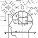
Francesco Franchi
'Here is how to remember. First you must choose a place. You walk around it, impressing every detail on your memory, until you can tour it in your mind when you are not there'.
Francesco Franchi has visually responded to the idea of the memory palace in the form of an infographic print. Conducting extensive research into the history of mnemonics he has skilfully distilled the chronological development of practice of the art of memory in a captivating and rational way.
Franchi is a graphic designer and journalist based in Milan. His intricate infographics combine images, words and numbers to communicate ideas with great efficiency and beauty. He is also the art director for IL, a monthly news magazine for il Sole 24 ORE - Italy's leading financial and economic newspaper- that was nominated for the D&AD awards in 2012.
© Francesco Franchi, 2013
francescofranchi.com
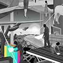
Mario Wagner
'Then the great moral evil of the Lawlords brought the Magnetisation. An aura was seen all over the world, great waves of light shivering in the sky. They saw the great waves of light, and their screens spewed out their last sign and went dark'.
Mario Wagner depicted Magnetisation, the massive magnetic storm that wiped the world's information infrastructure, in a mixed media collage piece. He has chosen to represent the moment that the event takes place when people have been lifted into the air, screens have turned to static and the world has just begun to fall apart.
Wagner is a German illustrator based in California. He creates large-scale paper collage works that bring together disparate elements from vintage magazines and juxtaposes them to create dark futuristic scenes. His work regularly appears in the New York Times magazine and the Wall Street Journal and he was recently selected to take part in the Absolut Vodka blank edition campaign.
© Mario Wagner, 2013
mario-wagner.com
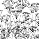
Stefanie Posavec
'The Thing hates accounting more than any other crime, because it is the opposite of Wilding. The more men account the world, the less wild it will be'.
Stefanie Posavec has visualised the different time periods featured in the story. For the Booming, the time when people used Accounting to generate accurate data, she measured the world using Google World and created the image based on the distances between all of the capital cities. In the Withering, the time when nature has begun to take over, the figures begin to disintegrate. In the final image of the Wilding, when society has become one with nature, measurements have become fragile plants growing out of the crumbled data.
Posavec is an American graphic designer been based in London. Interested in exploring the concept of 'data illustration', she uses information as the medium for visual experimentation. For much of her career she has worked with text, ranging from book covers and book layouts to interface design for literary websites and iPhone book apps.
© Stefanie Posavec, 2013
itsbeenreal.co.uk
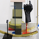
Åbäke
'I saw that we had come to a treasure house, filled with tricknology'.
Åbäke responded to a passage in the story in which the central character finds himself in a disused underground station surrounded by objects that he does not quite understand. Abake have entered the world of the story, imagining this society that is not allowed to preserve the artefacts of the past. They have assembled a vitrine of object mounts and a large sculpture support, as the knowledge of their original function is lost and could therefore be perceived of as precious as the objects they once held.
Åbäke is a collective of graphic designers formed in London in 2000. Their practice is hard to define and takes many multi-disciplinary outcomes, but much of their work concentrates on the social aspect of design and the strength of collaboration. Working under a number of different aliases they have curated exhibitions, hosted culinary events, founded a record label and a spy agency.
© Åbäke, 2013
With thanks to Richard Ashbridge
abake.fr
kitsune.fr
suzukiaffice.jp
dentdeleone.co.nz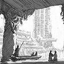
Némo Tral
'My eyes are open, I look around. Yes, there's something larger than me: I live in its ruins. My fellow Londoners, can't you see how we are diminished?'
Némo Tral's installation responds to the section of the story about the central character's past, when he was growing up in London in the ruins of the Olympic park. He began by sketching the real buildings in their current state and continued to visualise what they might look like in the time of the Withering. The illustrations appear as large stained glass windows that look out on a panorama of this decaying cityscape.
Tral is an illustrator based in Paris. He studied architecture and continues to work in this field, describing his interest in buildings as something he arrived at through drawing them. He creates ephemeral installations and graphic novels as stories to occupy and document forgotten urban spaces.
© Némo Tral, 2013
nemo-tral.com
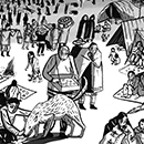
Isabel Greenberg
'Now, for the first time I understood what it meant to be an internet. We shared our learning. It flowed between us like sign, even though none of it was true sign, just our spoken words'.
Isabel Greenberg interpreted the passages about the main character's past and chose to focus on the key relationships with his family and his teacher Bilgee. Scenes from his childhood and his induction into the Memorialists, a group dedicated to the preservation of memories about the past. They are depicted on two hanging prints reminiscent of large wall tapestries.
Greenberg is a London based illustrator and graphic novelist. Her working process involves a combination of hand drawing and digital colouring. Greenberg's touching and evocative short story Love in a Very Cold Climate won the Observer short story prize in 2011.
© Isabel Greenberg, 2013
isabelnecessary.com
Frank Laws
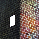
'I gave each spot a meaning, and as I populated it with the things I have been given to remember, the cell began to grow'.
Frank Laws created a series of intricate paintings that form an installation of the prisoner's cell. The scenes depicted inside the cell are the Prisioner's memories of London buildings. The narrow viewing points evoke the claustrophobia induced by spending day in day out in a confined space.
Laws is an illlustrator with a fascination with mundane details of everyday life. He works in watercolour paints, drawing ink and acrylic on stretched paper, applying layer upon layer to obtain richness and depth. Laws now lives between London and Paris, where he works as a in-house artist for Louis Vuitton.
© Frank Laws, 2013
franklaws.com
Sam Winston
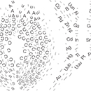
'It was part of something sacred and mysterious, called the Great Table of Elements. In the ancient libraries and hospitals the alphabet marks were chanted as a prayer'.
Sam Winston worked on the passage of text that reveals that the central character has been imprisoned, because he was found with a fragment of the Periodic table. Winston responded to the prisoner's perception of it as a form of religious object or incantation and has created three embossed metal pieces. Each one accurately depicts all of the elements that exist in three objects - a gold watch, a book and a SIM card. Winston chose these objects to represent the banned concepts of time, knowledge and technology.
Winston is a graphic artist based in London. He creates sculpture, drawings and books that experiment with language and words, both as carriers of message and meaning, and as visual information itself. Winston's works can be found in many museum collections including the Museum of Modern Art in New York, Getty Research Institute in Los Angeles and the Tate Galleries in London.
© Sam Winston, 2013
samwinston.com
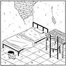
Luke Pearson
'Ideas,' he said, 'are not things. They are what you have instead of things. Instead of the good solid wood of this table. Instead of the water I know you crave'.
Luke Pearson has worked on the first interrogation that the prisoner experiences where he and his captor discuss the danger of ideas. Pearson has created a large scale expanded sequential illustration made up of a series of smaller drawings that are paced to reflect the movement of the prisoner between the interrogation room and his cell. Drawn speech moves between the inner dialogue of the prisoner and the conversation with his captor.
Pearson is a comic book artist and illustrator based in Nottingham. He wrote and illustrated the Hilda series of comics about the encounters of young girl living in a Scandinavian wilderness and the graphic novella Everything We Miss in 2011. The subjects in his stories range from surreal folk tales to very human stories of estrangement and heartbreak.
© Luke Pearson, 2013
lukepearson.com
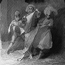
Alexis Deacon
'You dare question me? A man hunts. This is how nature ordained it in the beginning, before we trod the Sorrowful Road of civilisation'.
Alexis Deacon has responded to several interrogations that take place in the story and sequenced the prisoner's journey from the cell to his trial and torture. The intricately drawn and atmospheric scenes evoke the violence inflicted on the prisoner. The protagonists are drawn wearing traditional British folk costumes and masks and represent society unwinding backwards in time.
Deacon is an award-winning writer and illustrator of children's stories based in London. His books, illustrated predominantly by hand, using pen, ink, charcoal and wax pencil are poignant and captivating journeys into imaginary worlds. His books have twice been selected for The New York Times Best Illustrated Children's Books Award.
© Alexis Deacon, 2013
alexisdeacon.co.uk
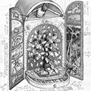
Jim Kay
'Oh my friend, you're so sad. If you follow the path of forgetting you'll have freedom of heart and peace of mind. You will have a clear conscience'.
Jim Kay worked in response to the final interrogation in the story, and created a three-dimensional illustrated cabinet. The vividly coloured interior drawings hold the prisoner's recollections from the Booming, memories as varied as Charles Darwin's Origin of the Species and the London riots. The prisoner's bleak reality is depicted in black and white in a series of powerful wall-mounted illustrations that portray the prisoner's breaking point and confession to his captor.
Kay is an award-winning children's book illustrator based in Northamptonshire. He uses with a broad variety of materials and processes in creating his drawings and enjoys experimenting with new techniques for each project. In his recent book, A Monster Calls, which won the Kate Greenaway Award in 2012, Kay created haunting and powerful scenes using mono-printing and ink rubbings.
© Jim Kay, 2013
jimkay.co.uk
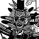
Le Gun
'The doctors performed great feats of surgery and roamed the cities, looking for the sick. It was a time of great wonder'.
Le Gun have brought to life a memory fragment that recalls the practice of medicine and doctors in a three-dimensional drawn installation. The immersive black and white piece reimagines an ambulance as a chariot driven by a medicine man and drawn by a team of urban foxes. The back of the ambulance contains the detailed body map of a patient as well as partly misremembered medical artefacts from times past.
Le Gun is a London-based illustration collective, which was founded in 2004. They communally execute large-scale drawings, murals and three-dimensional 'drawn' installations, and have exhibited internationally at locations including The Museum of Mankind in London, Art Brussels, Art Basel, and galleries in Paris, Berlin, Tokyo, Istanbul, and Beijing. They also produce the art annual LE GUN, which enjoys international cult status.
© Le Gun, 2013
legun.co.uk
Stuart Kolakovic
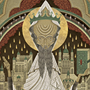
'I know the names of all seventy-two Lawlords. Among the greatest was Milord Rayleigh, who knew why the sky was blue. There was Milord and Lady Ayn Stein, who wrote the laws of relativity'.
Stuart Kolakovic interpreted the prisoner's memories of the Lawlords, the great scientists of the past. His illustrations, created through a mixture of hand-drawn and digital techniques, are reminiscent of both religious iconography and futuristic comics. They form part of a wooden altarpiece that depicts Einstein, Newton, and Rayleigh and their achievements.
Kolakovic is an illustrator and graphic novelist based in Staffordshire. Working under the pseudonym Herman Inclusus he has created a body of work that references both medieval illuminated manuscripts and Eastern European traditions of painting. He has worked for a wide variety of editorial and publishing clients including The New York Times, Lonely Planet, GQ Magazine and Penguin.
© Stuart Kolakovic, 2013
stuartkolakovic.co.uk
hermaninclusus.co.uk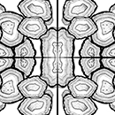
Hansje van Halem
'On a tile just by the head of my bed, I have placed a list of the ancient gates. It looks like a gold ring, with gems set into it, each a different kind of stone'.
Hansje van Halem responded to a passage about misremembered London underground stations that the prisoner likens to gemstones. She collaborated with the J.C. Herman Pottery to create thirty-two hand-painted floor tiles. Each unique gem shaped tile represents one of the stations the prisoner was tasked to remember.
Van Halem works as an independent graphic designer in Amsterdam with a focus on book design and print. In much of her work she intricately and painstakingly draws letters and patterns, both digitally and by hand, in what she describes as 'an ode to patience'. She teaches regularly at Royal Academy of Arts in The Hague and her work is in several museum collections.
© Hansje van Halem, 2013
hansje.net
Henning Wagenbreth
'Museum: A palace where the Lawlords went to muse. Museums were filled with treasures kept for musing on or amusement'.
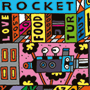
Henning Wagenbreth is and illustrator and graphic designer based in Berlin. His installation responds to the prisoner's definition of a museum and is made up of hundreds of painstakingly painted wooden blocks he calls Tobot Bloks. Piled as a brightly coloured tower, they feature words and images. The installation makes reference to the construction and deconstruction of culture and also acts as a metaphor for how language and meaning is constructed.
Wagenbreth is an independent illustrator and graphic designer in Berlin. His work includes posters, book and record covers, fonts, comics, postage stamps and sets for theatre. He uses a variety of techniques such as linocut, vector drawings, pen and ink, geometric shapes and distorted perspectives to make his images more abstracted yet easily legible. He has been awarded prizes at the Posterfestival Chaumont, the Poster Biennal Warsaw and The German Book Foundation.
© Henning Wagenbreth, 2013
wagenbreth.com
Oded Ezer
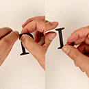
'Photoshop: A ritual conducted before going out into the world, in which the face and stomach are anointed with a powder called picksels'.
Oded Ezer has entered the time of the story and imagined different ways you might interpret type if you had lost the ability to read or write. His eight short films each interpret a playful definition from the story and experiment with things such as eating and setting fire to individual letters. His work challenges the viewer's perception of what it is to read words.
Ezer is a type designer based in Tel Aviv. Often described as an 'experimental typographer' he is the inventor of projects such as Biotypography featuring ants cloned with letters. His typography has been collected by museums such as the Museum of Modern Art in New York, Israel Museum of Art in Jerusalem, and Museum für Gestaltung in Zürich.
© Oded Ezer, 2013
ezerdesign.com

Erik Kessels
'At the height of the Booming, sign was so plentiful that it fell from the sky like rain. It rustled underfoot in autumn and rose and fluttered about the palaces and hospitals like apple blossom in spring. This was called advertising'.
Erik Kessels responded to two memory fragments that recall advertisting and recycling, creating a giant palace made from recycled advertising leaflets. The multiple layers of the structure, made up of thousands of partially legible messages act as both a comment on the overarching story and our present reality where we are overwhelmed by colours, shapes, and images in a constant onslaught of designed materials.
Kessels is co-founder and creative director of the communications agency KesselsKramer and a graphic designer, curator and photography collector. His witty and irreverent work is often described as 'anti-advertising'. Kessels has made and curated exhibitions such as Loving Your Pictures in 2006, The European Championship of Graphic Design in 2008, and Graphic Detour in 2011, 24HRS in Photos 2012, and Album Beauty 2012.
© Erik Kessels, 2013
kesselskramer.com
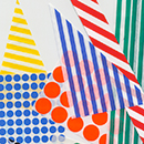
Na Kim
'Go wander creature where sign guides.
Go measure earth, weigh air and state the tides
Instruct the planets in what orbs to run
Memorise old time and regulate the sun'.Na Kim worked in response to a jumbled memory fragment outlining the laws of entropy. She created a large advertising billboard filled with abstract graphic symbols of organising tools that references a sentence where mankind is instructed to measure the earth.
Kim is a graphic designer based in Seoul. She participated to Werkplaats Typografie in the Netherlands between 2006 and 2008. She works predominantly with cultural and editorial clients, creating playful and colourful design and print. Besides many other projects, she initiated magazine project, 'umool umool' and was responsible for concept and design of GRAPHIC magazine. She was a curator for Brno Biennale, Chaumont Festival, Seoul Typo Biennale and took part in numerous international exhibitions including Millennium Magazines at MoMA in 2012 and Graphic Design Worlds at the Milan Triennale Museum in 2011.
© Na Kim, 2013
ynkim.com
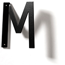
Peter Bil’ak
'I lay on the floor, watching the pictures in my memory palace spin and turn, gorgeous and bright. For the first time I could see them - not just in my mind's eye, but in reality'.
Peter Bil'ak's installation is a play on perspective. Working with the complete section of text he was given to work on, he created a large wall of reversed type. The sentence is illegible until the visitor passes by the work and looks back, at which point the text becomes readable and its meaning is revealed.
Peter Bil'ak is based in The Hague, The Netherlands working with graphic, type and editorial design. He started Typotheque type foundry in 1999, Dot Dot Dot magazine in 2000, Indian Type Foundry in 2009, and Works That Work magazine in 2012.
© Peter Bil'ak, 2013
peterbilak.com
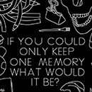
Johnny Kelly
'This is what we do for the dying. I am permitted to add one memory of my own to the store. The others will hold it, will cherish it as carefully as the words of a Lawlord'.
Johnny Kelly interpreted the finale of the story where the prisoner is allowed to add one of his personal memories to be remembered for future generations. In response he has developed a new web-based drawing app that allows visitors to contribute their own memory to a digital Memory Bank. Each week a screenprinted poster of all the memories submitted is added to the exhibition installation. In addition, an ever-growing sea of memories will be generated through online submissions, creating a legacy for the project.
Kelly is an Irish graphic designer based in London. He works across various disciplines including animation, graphic design and illustration. Most recently, his two minute film for Chipotle Mexican Restaurant won two Grand Prix at the 2012 Cannes Lions International Festival of Creativity.
© Johnny Kelly, 2013
Jointly commissioned by the Victoria and Albert Museum and Sky Arts
With thanks to Samsungmickeyandjohnny.com
nexusproductions.com
Video: Inspiration & Process
In these videos a selection of designers and illustrators talk about the process of creating their commission for the exhibition and how their work was inspired by the passage of text they were given from the story.
Peter Bil’ak
Peter Bil'ak's installation is a play on perspective. Working with the complete section of text he was given to work on, he created a large wall of reversed type. The sentence is illegible until the visitor passes by the work and looks back, at which point the text becomes readable and its meaning is revealed.
Hansje van Halem
Hansje van Halem responded to a passage about misremembered London underground stations that the prisoner likens to gemstones. She collaborated with the J.C. Herman Pottery to create thirty-two hand-painted floor tiles. Each unique gem shaped tile represents one of the stations the prisoner was tasked to remember.
Erik Kessels
Erik Kessels responded to two memory fragments that recall advertisting and recycling, creating a giant palace made from recycled advertising leaflets. The multiple layers of the structure, made up of thousands of partially legible messages act as both a comment on the overarching story and our present reality where we are overwhelmed by colours, shapes, and images in a constant onslaught of designed materials.
Na Kim
Na Kim worked in response to a jumbled memory fragment outlining the laws of entropy. She created a large advertising billboard filled with abstract graphic symbols of organising tools that references a sentence where mankind is instructed to measure the earth.
Frank Laws
Frank Laws created a series of intricate paintings that form an installation of the prisoner's cell. The scenes depicted inside the cell are the Prisoner's memories of London buildings. The narrow viewing points evoke the claustrophobia induced by spending day in day out in a confined space.
Henning Wagenbreth
Henning Wagenbreth's installation responds to the prisoner's definition of a museum and is made up of hundreds of painstakingly painted wooden blocks he calls Tobot Bloks. Piled as a brightly coloured tower, they feature words and images. The installation makes reference to the construction and deconstruction of culture and also acts as a metaphor for how language and meaning is constructed.

Become a V&A Member
V&A Members enjoy a wealth of benefits, including free entry to exhibitions, previews, exciting events and the V&A Members’ Room. In addition, you will be supporting the vital work of the V&A.
Buy or Renew Membership Online