British Design 1948-2012: about the exhibition
31 March – 12 August 2012
This was the first major exhibition to celebrate post-war British art and design, revealing the depth and quality of the Victoria and Albert Museum's collections while showcasing the richness of British regional collections.
The exhibition focussed on British post-war art and design from the 1948 ‘Austerity Games' to the present day. Over 300 British design objects highlighted significant moments in the history of British design and how the country continues to nurture artistic talent and be a world leader in creativity and design.
Video: British Design in 2012
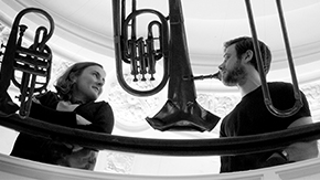
A number of designers involved in the V&A's exhibition British Design 1948–2012: Innovation in the Modern Age discuss aspects of the exhibition, and British design in general.
View transcript of video
Jay Osgerby, BarberOsgerby
We wanted to design something which felt like a piece of sporting equipment, something which felt tensile, tactile and useful. We were fortunate in the case of the torch that there’s a hell of a lot of history.
Edward Barber, BarberOsgerby
Yes we were really keen for the project to have a very strong narrative to it. It had to relate to the relay in a very strong way so various aspects of the brief directed us towards the shape of the torch and the whole pattern of the torch as well. And in fact LOCOG gave us a brief, an eighty page document which outlined the history of the games, including previous torches but also things like the performance criteria. It has to work in sub zero temperatures, it has to work at high altitudes and really strong winds.
Jay Osgerby, BarberOsgerby
This torch has been tested in the BMW wind tunnel in Munich at up to speeds of I think up to 70miles an hour. The design of the torch encompasses 8,000 holes which represent the 8,000 runners, and the triangular form of the torch which represents the three times the Olympics has been in London. And also the Olympic motto which is faster, higher, stronger.
Edward Barber, BarberOsgerby
Designers are working behind the most important companies in the world now and I think it doesn’t matter where you go in the world you’ll find a British designer working there, whether it’s in architecture, industrial design, fashion design or graphics, we are everywhere. And so there’s not really a sense any more I don’t feel of British design, it’s a good design but it’s a global thing it’s not restricted to Great Britian any more.
Margaret Calvert
I’d started working with Jock Kinnear, he was my tutor at Chelsea and he just came and said, ‘Oh, I’ve got this job and I need someone to help me as an assistant’. There was this committee set up by the government with Sir Colin Anderson as the chairman to redesign the motorway signs, not the roadsigns but the motorway signs. And we started a logical system how to put all the components together to actually get it working. There was no thought of extending it to all the roadsigns, the whole system, but a really bright civil servant called TG Asbourne, he was the one suggesting to Jock, why don’t we extend it to the entire network. I mean that was staggering really, we never thought it would ever go that far. The most difficult one actually was the children, the school children crossing. It was a very difficult one to draw, the human figure is not easy and I spent a very long time on that. I based the child on my idea of me as a seven, eight year old.
Andrew Stevens, GTF
This is a particularly tricky problem or interesting problem for this show because it’s over such a wide time span. There’s so many different styles, aesthetics. To that sense often with an exhibition that’s more focused, you’ve got an aesthetic to play against or take from but here we had to find something that would sustain itself through sixty plus years of design.
Paul Neale, GTF
And could adapt a language, it could create a common thread through the whole exhibition but at the same time could adapt which is done through pallet and colour from space to space responding to the different periods. It has to have a degree of neutrality to it so it doesn’t contradict any of the aesthetics of any of the individual periods. Having said that we had to choose something and we didn’t want to choose Helvetica and there did seem an appropriate choice in a typeface design by Margaret Calvert of Calvert and Kinnear, the creators of the road signeage system, one of the exhibits here, who also created the typeface for the Intercity 125 programme.
Andrew Stevens, GTF
It has a clarity and a strength and in that sense it’s easy to read and as Paul says, in that sense it’s got a kind of neutrality to it, it doesn’t fight too much and it seems to have a conceptual link, that idea of a little bit of a thread of the state and good design running through there but is still something people connected to. Everyone caught the train and everyone saw the ads and it was a part of everybody’s daily life as well.
Paul Neale, GTF
Purposefully it’s quite a workman like typeface but it does quietly express a mood like lots of typefaces do, it’s not in your face but it is generally reminiscent of British public design and there are different areas of British Design I think we are particularly good at, designing a public space, like some of the work in this exhibition. The work of Ken Grange, modest forms, quite workmanlike, very well designed, quietly elegant.
Kenneth Grange
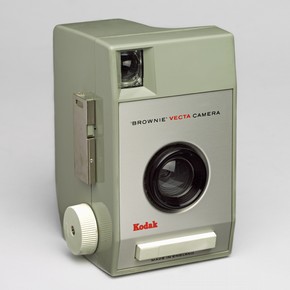
I was asked to design the inside of a pavilion and I had virtually finished my job and I said, foolishly in a way, but I said this would be a marvellous job if the cameras and products weren’t so damned ugly. And a man on my left who was busy unpacking, he was obviously something to do with the display arrangements and he said, ‘Well that’s very interesting, what would a designer charge a firm like Kodak to design a camera’, and I said, ‘Well, I don’t know’, I hadn’t thought about it at all, I hadn’t done anything like that in my life and I said, ‘Well I don’t know, a few hundred pounds’, and that was it. I went back to London and the following morning the telephone rang and I’m on my own in my own little bedroom come studio and the man said I am head of development at Kodak and I understand you are going to design a camera for us, and that was it. That’s absolutely a true story and from then on a whole raft of products came from them.
This was the first camera I did for them, called the 44A which is a very strange looking thing today, but it was successful and it then lead to forty odd years of designing cameras for them, and in particular this one which is the one which is in the show. And what it does is tell you how if you have some success and if you have a good relationship with a maker, he begins to trust you and begins to listen to you. I’ve been thinking about who I really admire in these days and I think it’s a very tough call because there are plenty of very good designers we have here but I think of all the designers I know we have around who I think are a big influence, as well as being a big single as it were practitioner today is Thomas Heatherwick. I think Thomas is an exceptional man in the scope of his skills, the scope of his intellect. He’s very accessible, and by no means a prima donna but he absolutely and consistently surprises and staggers you with the scope of his thinking and the scope of his vision.
Thomas Heatherwick
Getting the chance to design the bus was so special for the studio because London’s transport authority hasn’t commissioned a bus design for over fifty years. It felt that there were all these challenges and opportunities where we want to get wheelchair users in to buses and we want to get mothers with buggies and we know to be reliable with the quantity of traffic on London’s streets. We can’t just have one door to a bus so everyone just waits in a queue, we need a bus with three doors so people can quickly load and unload. It comes down to all the details. What are you going to press, what’s the bell push to stop that bus, and what are the steps that you’re going to walk up, and how’s the window, where’s your elbow, do you bash your head on the end, so our sense was that it was going to be a collection of detail and it wasn’t just going to be about one idea. We needed to have a philosophy that could permeate through and inform all of these details.
When I think of British design, I find that somehow one is talking about people from all over the world who have chosen Britain to base themselves. A lot of modern history has been rooted in what has come from the United Kingdom and so it doesn’t feel like a shallow layer of superficial thinking and institutions like the Victoria and Albert Museum constantly put things in huge contexts and that’s a very soulful backdrop to work around and within.
Inside the exhibition
The following sections were featured in the exhibition.
Introduction
In 1948 London hosted the first Olympic Games after the Second World War. The ‘Austerity Games’ (as they became known) took place at a time of economic crisis in a city devastated by bombing, but they provided a platform for reconciliation and reconstruction. In 2012 Britain welcomes the Olympics once more, and while the spirit remains, the context in which they are taking place has entirely changed. British Design 1948–2012 traces those changes by exploring buildings, objects, images and ideas produced by designers and artists born, trained or based in Britain.
The displays examine the shifting nature of British design over 60 years: three galleries respectively explore the tension between tradition and modernity; the subversive impulse in British culture; and Britain’s leadership in design innovation and creativity. The exhibition reveals how British designers have responded to economic, political and cultural forces that have fundamentally shaped how we live today. They have created some of the most inventive and striking objects, technologies and buildings of the modern world.
Tradition & Modernity
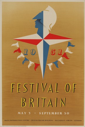
The impact of the Second World War on the social, economic and physical fabric of Britain was immense. The task of reconstruction dominated the post-war years. In 1945 a Labour government swept to power, and its radical plan for a comprehensive Welfare State would be broadly supported by all governments for the next 30 years. The drive for modernity in the rebuilding of Britain changed the nation forever. Events such as the Festival of Britain in 1951 presented a progressive view of the future and in the decades after the war Britain’s cities and homes were transformed.
However, a preoccupation with British traditions was often just below the surface and the grand spectacle of the coronation in 1953 reaffirmed traditional values for a world-wide audience. For many, the heart of British tradition was seen to reside in the land and many artists and designers explored themes that celebrated rural life and the countryside
Subversion
From the 1950s a new generation of Britons challenged the values of their parents. The focus of design moved from reconstruction to revolution. In the 1960s and 1970s, fashion, music, shopping, interiors and film enjoyed a fresh prominence as expressions of identity or radical intent. To adapt a common phrase of the time, the personal became political – and visible.
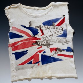
In Britain’s cities the shift was particularly powerful. From ‘Swinging London’ in the 1960s, through the nihilism of Punk in the 1970s, to the sharp presentation of ‘Cool Britannia’ in the 1990s, artists and designers pioneered an irreverent approach that marked the cultural landscape forever. In the studio and on the street, this subversive spirit has come to define British creativity for the past 50 years. Its sources are wide-ranging, from art students demanding reforms in the 1960s to Britain’s unique urban culture and social mix.
Innovation & Creativity
Britain has long been a pioneer of new ideas, particularly in the areas of industrial design and technology. Innovation has characterised British design from the introduction of spinning machines in the 1780s and the engineering of ships and bridges in the 1840s to the development of computer codes after the Second World War and the invention of the worldwide web in the 1980s.
Over the last half century, design culture has moved firmly away from traditional manufacturing towards innovative financial, retail and creative services. This radical shift has been accompanied by new attitudes towards commodities and global communication, which have fundamentally altered the way design is produced, consumed and understood. British designers have stood at the forefront of change. In so doing, they have created some of the most iconic objects, technologies and buildings of the last 60 years.
Download the exhibition panel text as a PDF (95.6 KB)
Download the exhibition panel text as a Word document (107.5 KB)


