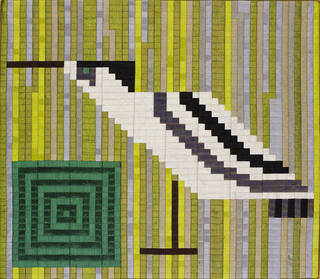
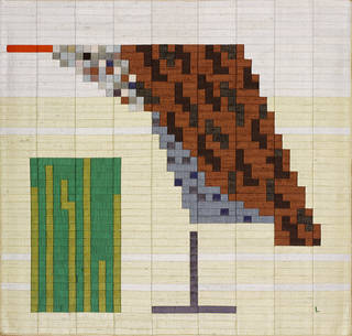
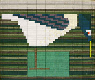
From the mid-1970s, textile designer Lucienne Day (1917 – 2010) found a new form of creative expression, creating one-off compositions in silk. Using a construction technique derived from traditional patchwork, her 'silk mosaics' are composed of 1 cm squares and strips of silk, the design emerging through carefully juxtaposed blocks of colours and weave textures.
Lucienne Day had been designing printed textiles for industrial production from the mid-1940s onwards. In the 1950s and 60s her regular commitments included creating a collection of up to six new designs a year for Heal's alone, as well as patterns for wallpapers, table linen, carpets and ceramics for many other companies. Like her husband, the furniture designer Robin Day, she believed in high-volume industrial production as a means to make good design affordable and accessible to everyone.

But by the mid-1970s Lucienne Day had become tired of the constant pressure to produce designs to commercial deadlines. Times had changed. Three of her long-standing clients – Tom Worthington of Heal's, Michael Tomkinson of Tomkinson's carpets, and Ron Crawford of the table linen company Nova Products – had retired, and she "was suddenly left with three firms I wasn't interested in". Most important of all, economic uncertainty had made manufacturers less adventurous – a reaction against mid-century modernism, the new fashion was for nostalgic ruralism and Victoriana. For nearly three decades Lucienne Day had both led and moved with changing styles, but she could not and would not adapt to what she saw as a retreat from modern design.
Though she was in her early sixties she was not ready to retire, so she cast about for another form of creative expression. She began experimenting with stitching tiny squares of silk, using a technique derived from patchwork, eventually devising a new textile form she named 'silk mosaics'. Day continued in the role of designer and did not make the works herself. From the late 1970s she employed skilled assistants, principally her niece Karin Conradi, to hand-stitch the works to her designs.
A new technique
Though the technique was derived from that used in patchwork, Day distanced herself from the patchwork tradition and the handcrafts movement. Her silk mosaics were conceived as artworks, not objects for practical domestic use, and they differ from patchwork in a number of ways: they are made from richly-coloured and textured Thai or Indian silks, rather than printed cotton, and are arranged in discrete compositions without repeat patterning. Rather than a variety of shapes and sizes, the compositions are made from uniform 1 cm squares or strips, hence the term 'mosaic' which recalls the tiny tesserae of Roman mosaics. Lucienne Day devised the term 'silk mosaic', or 'silk mosaic tapestry' for this new textile medium, suggesting associations with architecture and interior design, rather than the domestic realm of patchwork.

Stylistically, Lucienne Day's silk mosaics can be seen as a development of the large-scale purely abstract designs she produced in the late 1960s and early 1970s. The clear-cut hard-edged patterns of Causeway (1967), Apex (1967), Chevron (1968), Lucienne (1974) and Panama (1975) seem to prefigure the silk mosaics, which are likewise built up from rectilinear elements. She designed the silk mosaics on graph paper, a technique which she had previously used when designing carpet patterns in the 1950s and 1960s.

The silk mosaic designs
Lucienne Day was a formidably talented pattern-maker and colourist who, as an industrial designer, had worked with a variety of media, though the dominant one was printed textiles in repeat. The silk mosaics offered the same opportunity to work with composition and colour without the constraints of having to produce a pattern in repeat. On the other hand, the 1 cm square or strip unit imposed a different kind of discipline.
I went into industrial design because I wanted people to have good things at a reasonable price. It's true that the silk mosaics are more elitist, but I think I've earned it. It's also a question of staying creative. If I had gone on producing designs for printed textiles, I mightn't have given of my best because I was getting bored.
-.jpg)
The majority of these compositions are entirely abstract. Even those that are figurative are highly abstracted by the geometric technique. Many of the designs are inspired by landscapes (e.g. Their Exits and their Entrances, The Island) or architecture (Black Window, White Door, The Castle and other Stories). Day played with words and ideas in many of the titles – Circling the Square, Enigma, Memory Game and so on. The extensive Tangram series is based on the Chinese puzzle of that name. Mythological or symbolic imagery is represented in Noah's Flood, The Apple, the Signs of the Zodiac and others.

The Decoy and Pond series
The Decoy and Pond series of six silk mosaic works, now in the V&A's collection, shows the quirky sense of humour displayed in many of Lucienne Day's printed textile designs of the 1950s. A 'decoy' is an imitation bird, used by the marksman to attract real birds. In the sequence, the various 'decoys' (represented by six recogniseable water birds) move and behave as if they are alive:
Decoy and Pond, a seemingly abstract design…is composed of six quite different panels which form a sort of narrative as a wooden decoy becomes alive, takes more and more interest in the pond, ending up sitting in it.


The series was acquired by the V&A in 1983 from a private collector. The first work in the sequence appears to be identical to another work hung in the Days' home in Cheyne Walk, Chelsea. Keeping this piece for herself, Lucienne built on the narrative to produce the sequence of six now in the V&A's collection. Each work is embroidered with a tiny letter 'L' in the lower right-hand corner by way of a signature.


The V&A holds one other silk mosaic by Lucienne Day, called Flying in Blue (1985). The piece is similar to one called simply Flying, which is worked in a different colourway, a technique borrowed from her experience as a designer of commercially printed textiles. Although composed of abstract forms, the work has a lively sense of upward movement, so common in Lucienne Day's work. As is often the case, its title invites the viewer to use their imagination when exploring the image.

Locating the silk mosaics
It seems likely that several hundred of Lucienne Day's silk mosaics were designed and made between the mid-1970s and the end of the century, when she retired from design. While most were bought for domestic display, her work on these pieces also included some major commissions for public and corporate spaces. In the course of their careers the Days had worked extensively with architects, manufacturers and retailers and Lucienne was able to draw on these contacts, securing several commissions for large-scale pieces for architectural interiors. By far the largest commissions were for the coffee shop at the new John Lewis store designed by architects Ahrends, Burton and Koralek. She responded to the tall light space by creating a five panel design called Aspects of the Sun (1990) which when hung measures 16ft high by 9.5ft across. This took two years to make and consists of tens of thousands of hand-stitched pieces. The success of Aspects of the Sun led to a further commission for the opposite wall. Islands (1991) is composed of 12 pieces of identical size which together make up a single landscape.
The digital archive of the Robin and Lucienne Day Foundation includes over 250 images relating to the silk mosaics, but these records are incomplete. The Foundation is inviting owners of silk mosaics to help complete their catalogue of these unique works of art. Do you own a Lucienne Day silk mosaic? Help rediscover lost works by photographing your mosaic and sharing on social media with the hashtags #silkmosaic #LucienneDay, or contact the Foundation.
Find out more about this material with our book, Silk: Fibre, Fabric and Fashion.


