Held at the V&A in 1946, 'Britain Can Make It' was a landmark post-war exhibition, showcasing the best of modern British design. Margaret Timmers, former Senior Curator of Prints at the V&A, explores the development of Ashley Havinden's patriotic exhibition poster, revealing a fascinating group of original sketches and alternative designs, in this edited extract from the book, 'Britain Can Make It: The 1946 Exhibition of Modern Design'.
Margaret Timmers' essay 'Ashley Havinden and the Britain Can Make It Poster' appears in full in the book Britain Can Make It: The 1946 Exhibition of Modern Design, published by Paul Holberton Publishing in association with V&A Publishing and the University of Brighton Design Archives, edited by Diane Bilbey, 2019.
I believe the only ideal a designer should work to is complete clarity of expression. Not only clarity of words, or clarity of picture, but 'idea' clarity.
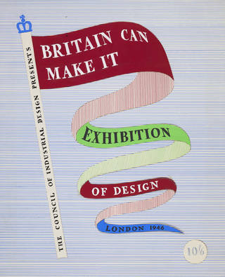
The idea communicated in Ashley Havinden's Britain Can Make It (BCMI) poster is one of patriotic celebration. The upbeat design features a crown-topped flagstaff lettered 'The Council of Industrial Design Presents' (meeting the Council's wish to bring its existence to wider public attention), from which flutters a multi-coloured pennant on whose surfaces the exhibition title, venue and date are proclaimed. Dispersed across a sky-blue background the names of the types of exhibits form a lively asymmetric pattern. The lettering, originally hand-drawn, is based on Times New Roman (bold weight), launched by Monotype Corporation for The Times newspaper in 1932, a fashionable font that would have been perceived as modern, authoritative and decidedly British.

Incorrectly, as it turned out, the Council of Industrial Design viewed the V&A as a challenging venue for its exhibition in terms of public appeal:
As the Victoria and Albert Museum is not a recognised exhibition centre and has probably never been visited for any purpose by a large proportion of the population of London (especially of the Eastern half) it is considered necessary to increase accordingly the estimate for expenditure on press and advertising and publicity on the hoardings and underground. The success of the Exhibition may turn upon our ability to induce the mass of people to accept the V&A as an appropriate place of resort for this purpose.
A Public Relations Department was formed for general publicity and public relations, and press work, while advertising the exhibition was assigned to a group of agencies comprising the London Press Exchange, S.H. Benson, Everett's Advertising, and W.S. Crawford Ltd. (where Havinden was Art Director). A committee of members of these four was responsible for the choice of a poster and the banner symbol. Under them, Poster Services Limited looked after distribution. The committee was also responsible for display advertising, banner strips on buses, linen banners over roadways, etc. Three-dimensional poster displays were placed in all Odeon and Gaumont-British cinemas. In spite of a printers' overtime ban (which did affect production of the exhibition catalogue) and post-war paper shortages, large numbers of the exhibition poster were produced in various sizes. A relief-effect version, adapted to fit the available space, was skied above the Exhibition Road entrance to the museum, where, colourfully flanked by six Union flags and above a banner-like 'Entrance' sign, it made a morale-boosting statement in defiance of post-war greyness and austerity.

By the time Havinden (who signed his work, and was always known as, 'Ashley') was invited to design this poster he was an influential graphic artist and a leading figure in his profession, acclaimed for his sparkling designs for posters and advertisements, typography, packaging and corporate identity (which he called 'company handwriting'). He had joined the advertising agents W.S. Crawford Ltd. (founded by William Crawford) in 1922 as a nineteen-year-old trainee layout artist. Early outside influences were the distinguished typographer Stanley Morison, an advocate for the improvement of design and typography in advertising, and Edward McKnight Kauffer, the American designer whose dramatic posters he revered.
While travelling with Crawford to Germany in 1926 to visit type designers and foundries, Havinden became aware of Bauhaus graphic design, admiring a practice that favoured asymmetrical typography, the elimination of extraneous detail, and the use of white space as part of a dynamic composition. After the war, during which he served as an officer in Camouflage, Havinden returned to Crawford's as Art Director, where he took on quasi-official work such as the BCMI commission, as well as devising new campaigns for commercial clients – styling for Liberty, re-branding for KLM, packaging for Richard Shops, and modernist graphics for the Daks trade name. As a poster designer his work may be viewed in the context of other mid-century moderns, such as Hans Schleger ('Zero'), Abram Games, F.H.K. Henrion and Tom Eckersley, all of whom believed in the simplification of form for optimum clarity, and in the design of text and imagery as an integral whole.
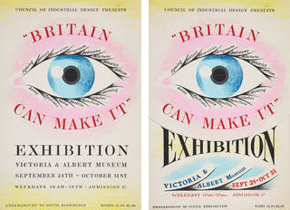
In the Ashley Havinden Archive, held by the Scottish National Gallery of Modern Art in Edinburgh, is a fascinating group of original sketches and artworks showing the genesis of the artist's thought as he tried out various concepts for the BCMI poster, catalogue cover and guide. In addition to the flagstaff device, he explored motifs based on a set of craftsman's tools, a radiant eye and a pointing finger, as well as alternative lettering designs.

The preliminary flagstaff design for the exhibition catalogue included the words 'Of Design' after 'Exhibition', and the venue and date ' London 1946', neither of which appears in the final versions. The use of variant colourways in the preliminary and final designs shows Havinden's inventive approach. The line drawing and cross-hatching style were carried forward, in adapted form, into the final version of the penny guide.

There is a visual link between the floating abstract shapes of an unused poster design and the bands of lettering that appear on the final poster, giving an insight into the artist's thought process. The 'discs' on which the exhibit types are listed were a favourite in Havinden's design repertoire. Metal discs were used in a BCMI design quiz, and discs were incorporated into the cover illustrations to the Council of Industrial Design's domestic advice book, Furnishing to Fit the Family (1946).

It may be that some of the ideas arose out of discussion with the Exhibition's other contributors, since 'pointing hands' indicated Misha Black's 'Birth of an Eggcup' section in the exhibition, and an 'all-seeing designer's eye' appears throughout: a huge Perspex eye was hung in the 'Designers Look Ahead' display in the Hall of the Future, designed by Basil Spence, and another 'Mr Designer' emblem with large eye, designed by James Gardner, appeared frequently in the exhibition. Possibly Havinden's design was an early thought to tie in with these ideas, but a flag-waving emblem was ultimately considered a more patriotic approach. Havinden would later recycle his own 'eye' image as a striking advertisement for the services provided by Crawford's agency.
The chosen flagstaff emblem was a favourite in Havinden's repertoire – used to dramatic effect in his 'Eno's Fruit Salt' poster of 1927, in which three horsemen charge diagonally under the banner of Eno's. It appeared again in his poster for Liberty Fabrics of 1949, the pennant evolving into a multi-patterned helix.

It may be thought that Havinden's device for the BCMI poster was unlikely to cause controversy, but the decision to depict a schematised crown on top of the flagstaff caused a flurry of correspondence between the Council of Industrial Design and the Home Office, which had to adjudicate over the protocol for use of a royal emblem. The latter took the view that "To show it over a pennon carrying wording (which is itself rather questionable as a matter of heraldic practice) does ... raise special considerations". Finally it was agreed that "having regard to the form which they have adopted for the crown, we can safely say that the Home Secretary would not wish to take exception to its use for the purpose in mind". This was fortunate in light of the poster's popular appeal.
This is an edited extract from the book Britain Can Make It: The 1946 Exhibition of Modern Design (2019).
The Ashley Havinden Archive, held at the Scottish National Gallery of Modern Art contains over 30 designs for the Britain Can Make It commission.
Find out more about Britain Can Make It.
Discover more with our book, The Poster: A Visual History.


