The late 19th century was the heyday of French poster design, when the likes of Jules Chéret (1836 – 1932) and Henri de Toulouse-Lautrec (1864 – 1901) promoted well-known performance venues such as the Moulin Rouge in Paris. Billboards were also used to advertise an expanding array of branded food and drink, as innovations in food production, transportation, and packaging techniques led to a rapid increase in consumer choice.
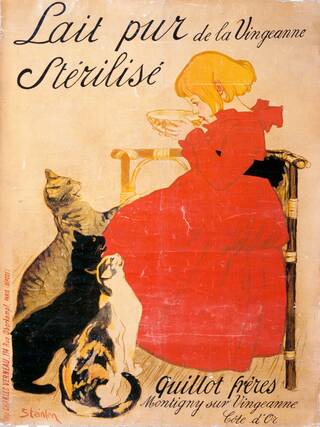
Dating from 1894, one of the earliest food posters in our collection advertises pure, sterilised milk, by Swiss artist Théophile-Alexandre Steinlen. The sterilisation process was first developed in 1889, so pasteurised milk was a revolutionary new product when this poster was commissioned by the Quillot Brothers, owners of a dairy in the Vingeanne region of France, around 200 miles from Paris. Steinlen's design uses the double ploy of both cute cats and an adorable child, demonstrating the deep-rooted appeal of such motifs in product advertising. The design was soon adopted by Swiss company Nestlé for their own early dairy marketing.
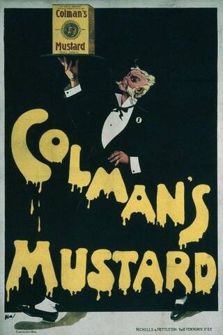
Most of the food products featuring on posters in this period were dry or canned goods. Still household names today, Heinz and Colman's were two early giants of mass production with a savvy understanding of marketing. In this poster from 1900, a packet of Colman's mustard is elevated, literally, by a rather eccentric looking waiter in black tie. The branding is front and centre with the unmissable yellow lettering, complete with pleasingly unctuous drips of mustard, visible from a great distance.
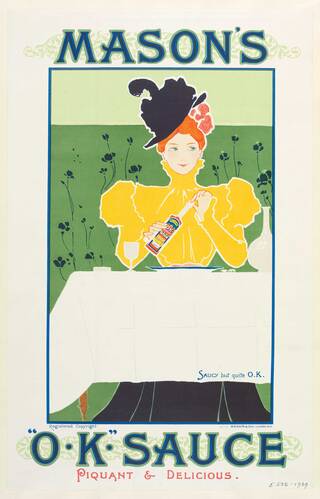
Originating in Norfolk in 1814, Colman's is one of the oldest food brands still in production. They introduced their recognisable yellow packaging and bull's head logo in the 1850s, cornering the condiments market by buying up many other rival companies, such as George Mason's OK Sauce, along the way. A poster for OK Sauce, also from 1900, demonstrates a more traditional approach, reminiscent of the Art Nouveau motifs found in art and literature magazines at the time.
Colman's advertising account was handled by S. H. Benson, an early advertising agency set up on London's Fleet Street in 1893 to serve a single client, Bovril. Benson succeeded in making Bovril internationally famous by routinely claiming that this brand of beef drink boosted strength and vitality, with various unsubstantiated slogans such as, "Bovril will carry you further than the train", and will "make men" of baby boys.
This memorable image of a weeping bull lamenting the concentration of his hulking brother into a small jar of rich beef extract was one of several poster designs that tickled the British public's sense of humour. The concept was cooked up in 1896 and was so popular, it had multiple outings throughout the first two decades of the 20th century, and was even parodied in political poster campaigns during the 1906 general election.
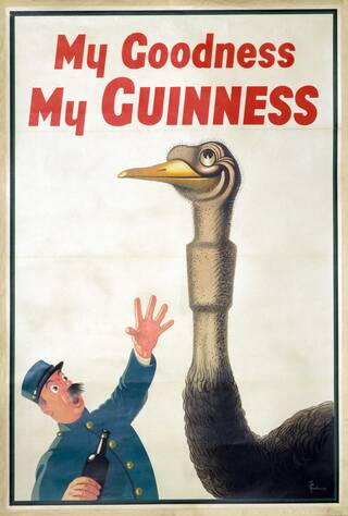
Benson was fast attracting corporate clients with such witty campaigns and other advertising initiatives, such as originating the double page advertising spread in British newspapers. The agency also had a knack for spotting graphic design talent and gave several artists their career break, including John Gilroy in 1925, who would remain the company's in-house artist for 35 years. Gilroy was responsible for the famous Guinness toucan and other zoo-themed shenanigans, alongside the crime writer Dorothy L. Sayers, who came up with the slogan "Guinness is Good for You", in one infamous campaign.
The Guinness family wanted wholesome campaigns that played down any negative links between alcohol and ill-health. The "Guinness is Good for You" claim was backed up by a single market research session carried out by Benson, in which a select group of people had agreed that drinking Guinness made them feel good.
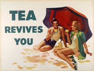
If a claim could be made for the restorative properties of a particular food or drink, however minor, these were sure to be reflected in poster advertising. Tea was another product that was rigorously associated with health benefits, this time by the Empire Tea Market Expansion Bureau, who set out to boost a commercial industry heavily linked to colonialism and the formation of global trading networks. Tea was perceived, especially in the USA, as being a women's drink, so stylish poster campaigns were launched to make the drink universally appealling.
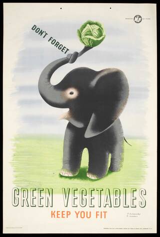
During the Second World War, the skills of poster artists were immediately diverted from commercial brands and employed by the Government to deliver public information messages. In 1941, Abram Games, a London-born artist, was called back from a year in the infantry to utilise his design talents for the War Office. The need was especially great given that British farming had stagnated in the inter-war period, and feeding the nation relied heavily on foreign imports. As German U-boats began to disrupt shipping, it was necessary for Britain to become self-sufficient, or risk being starved into defeat. Posters by artists like Games and Tom Eckersley provided essential tools to educate the public on diet, fitness, rationing, self-sufficiency, and to promote the 'Garden Front' movement, transforming public parks into allotments for growing vegetables. Eckersley was also a lecturer and was the first person to establish undergraduate Graphic Design degrees in Britain after 20 years at the top of the profession.
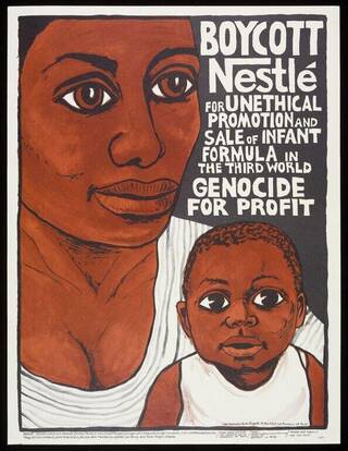
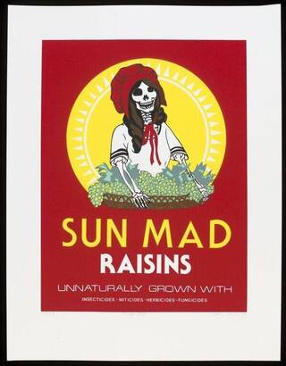
In the post-war years, posters were increasingly used to promote political causes concerning food, from shortages to boycotts. The Swiss corporation, Nestlé, one of the largest food companies in the world, came under fire in the 1970s for their policies on marketing baby milk formula. Gaining traction in 1977, the boycott continues in waves of resurgence today. Another ongoing concern in food production has been the use of pesticides on crops and pollution caused by chemicals in the agricultural industries. Artist Ester Hernandez used an arresting poster design, mimicking the famous 'Sun Maid' Raisins logo, to highlight the danger of death associated with the four key pesticides used in commercial grape growing. Her design speaks to the fact that in the USA, those at the brunt of this risk are often migrant workers, particularly indigenous people from Central and South America.
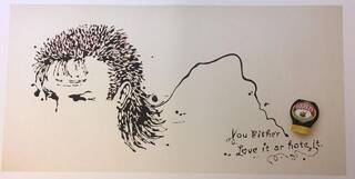
Advertising has become ubiquitous in the industrialised world, and the V&A continues to actively collect key examples of contemporary poster design. One of our most recent acquisitions is a 2006 illustrated series advertising Marmite, titled 'Love it or Hate it'. This poster series intended to whip up debate by picturing divisive public figures such as George W. Bush, then American president, and questionable style choices such as the 'mullet' hairstyle – drawn in marmite, to promote the product's new squeezable packaging. It's a prime example of how 21st-century food brands have had to experiment with diverse imagery and even flirt with controversy in order to capture public imagination.
Find out how you can view posters in our collection in our Prints and Drawings Study Room.

