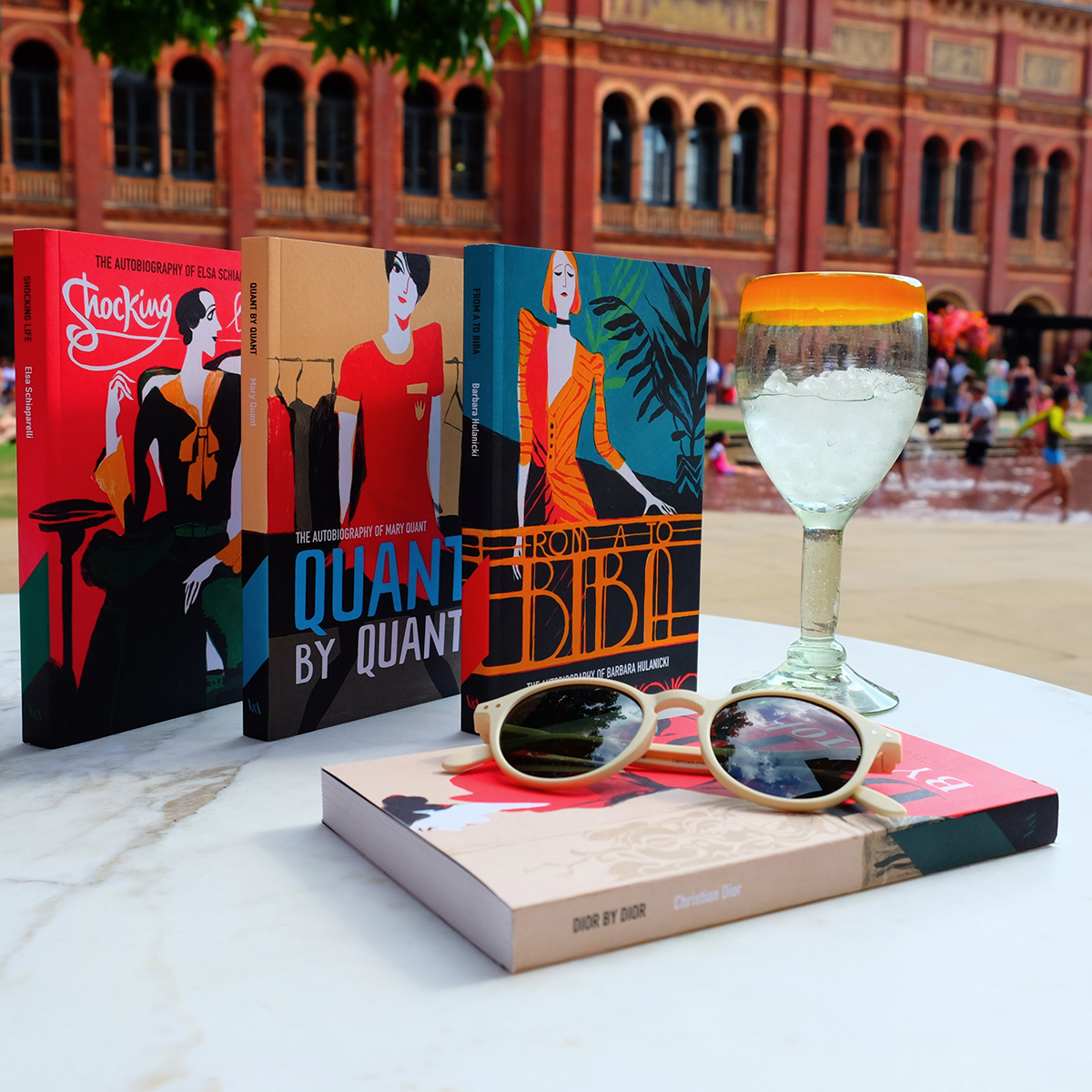
The bank holiday weekend is approaching and while you’re probably reaching for your sun cream and pool sliders, I’d contend your beach bag isn’t ready till it’s brimming with books. Thankfully, our newly reissued autobiographies are the perfect size for your hand luggage.
Penned by the twentieth century’s most inspirational designers, from Elsa Schiaparelli and Christian Dior, to Barbara Hulanicki and Mary Quant, these books serve as an invaluable history of fashion.
Each edition is illustrated by Beatriz Lostalé Seijo, a 25-year-old, Galician artist based in Cambridge. Lostalé Seijo’s style is characterised by bright, flat colours and a limited palette, with forms captured by shape more so than line.
Hi Beatriz. To start, tell us how you got into illustration.
I have always had a passion for drawing and painting, which led me to study a BA in Fine Arts. It was during my degree that I became more interested in illustration. I found this discipline allowed me to combine my passion for painting and design. I finally decided to move to Cambridge to study a MA in Children’s Book Illustration, which was a rewarding and life-changing experience.

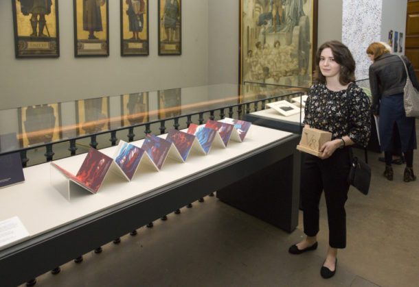
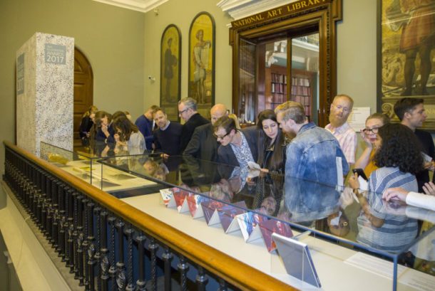
Last year, you won the V&A’s Student Illustrator of the Year competition. Describe your entry and your experience of winning.
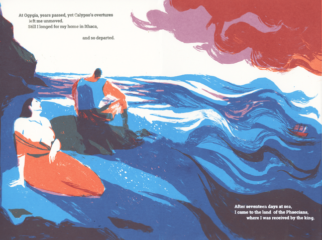
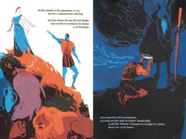
I entered the competition with a screen-printed reimagining of Homer’s epic, The Odyssey, in an accordion book format. Composed of fourteen panels, it depicts Ulysses’ journey chronologically, and it is intended to serve as an introduction to the text for younger readers, as well as a fresh take for longstanding fans.
I was shocked to learn I had won the Student Illustrator of the Year Award. The fact that The Odyssey was chosen among such a wide range of stunning illustration work was flattering, as well as a surprise. Needless to say, it was an absolute honour to be exhibited in the museum, and an incentive to keep pushing myself forward.
Why did you choose to illustrate Homer’s Odyssey?
For years, I have had a great interest in Greco-Roman culture and literature, and I knew that I wanted to work on a project that reflected this. I was experimenting with different book formats and I began to work with accordion books.
I realised the accordion format perfectly fitted the idea of journey, sea and flowing described in The Odyssey, and so I decided to illustrate this cornerstone of classic literature.
What happened between winning the illustration award and being asked to design our autobiography series?
My time was predominantly focused on networking and developing new projects, as well as keeping up to date with my pre-existing commitments. Luckily, I had recently finished my MA. This provided me with enough free time to ensure all projects, both new and existing, were given an appropriate amount of attention.
How did you approach the job of illustrating our covers?
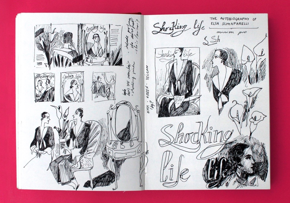
Reading about the lives of these designers, as well as watching interviews, was a good starting point to get a better understanding of who they were, and what their creations said about them.
In practical terms, what I found most useful was looking at photographs of their studios, shops and homes at the time. I was able to use these images to get a sense of their personalities and see how they would have gone through the creative process.
Editor Sophie Sheldrake was also a huge help, by providing extra material and giving her insight when I was struggling to capture the essence of the brands.
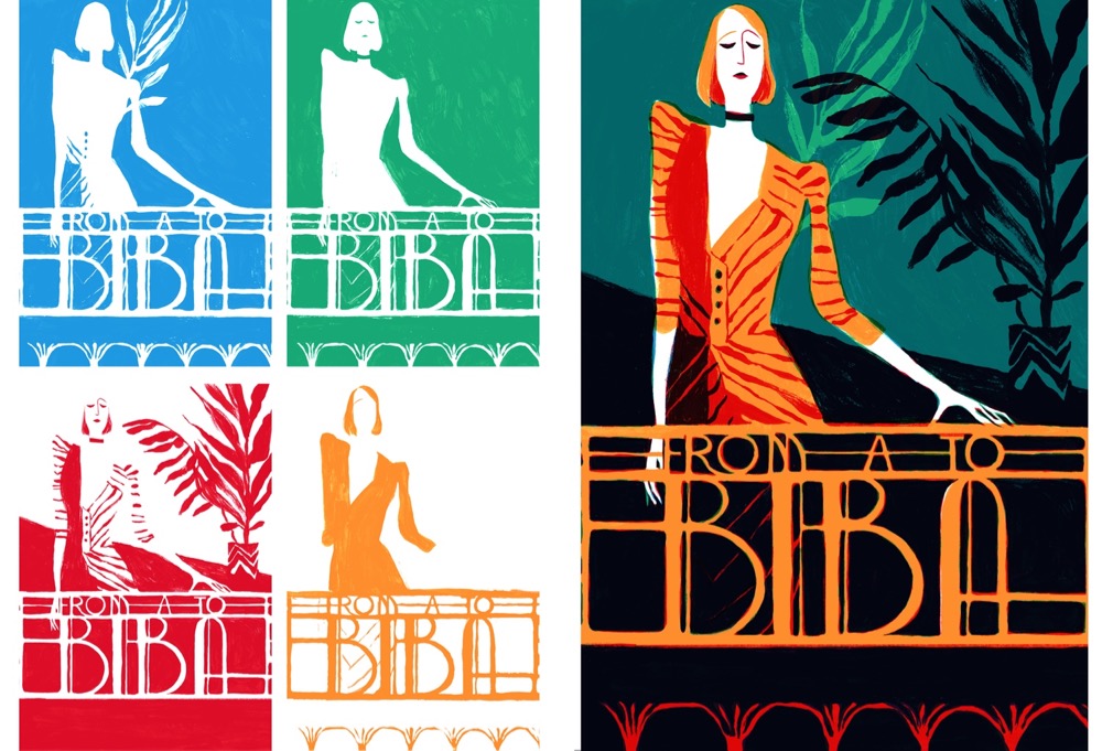
And tell us a little about the covers.
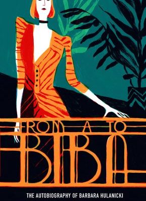
My intention with each cover was to reflect the personality of the designers, or to capture the atmosphere surrounding their creations. With From A to Biba, I was inspired by images of Barbara Hulanicki’s boutique, and so I tried to represent the elegant interior of her shop as opposed to Dior by Dior, where I chose to illustrate the feeling of opulence and luxury associated with the brand, using some of the photographs of his dresses in luscious locations as reference.
A common element to all the covers is that they all depict an emblematic garment by each designer – most of which can be found in the V&A collection.
The different hand-rendered typographies in the covers are meant to be evocative of the fonts used in the first editions, ensuring there was a link between the new covers and the original design of the books.
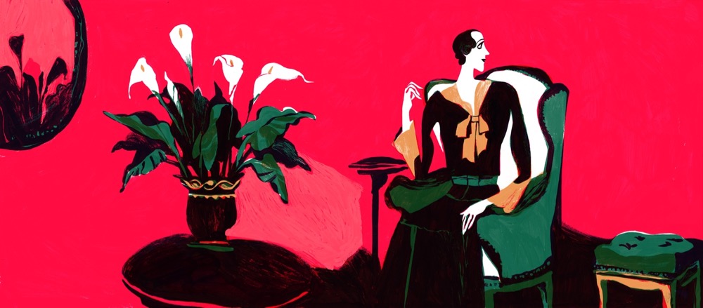
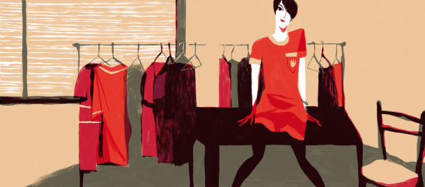
What materials do you use to achieve your bright colours?
Although the colours look very bright in the finished illustrations, the images are initially produced in black and white. My working process is heavily influenced by screenprinting techniques, where the colour is separated in layers that are printed in top of each other, creating different tones with their superposition. I have adapted this method to my working process. This way, I draw the different layers separately using gouache and pencil. I then scan them to add the colour digitally, and merge the different layers into a single image – the final result.
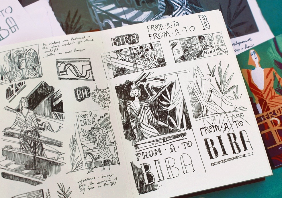
Tell us about a typical working day.
It is hard to describe a typical working day, as there is rarely a routine when you are a freelance. I usually have an early start and spend some time writing and replying to e-mails. There are weeks in which I need to juggle my illustration work with other commitments and jobs but, ideally, I would be able to spend most of my time working on commissions. I always try to keep time for personal projects, as this allows me to keep experimenting and playing with new ideas.
Are there any artists, illustrators or designers who influence your work?
I usually turn to a wide range of references for inspiration when I’m working – from propaganda posters, to medieval miniatures, ceramic works or wallpaper designs. I often find myself looking at avant-garde painters or mid century designers for inspiration. I would say that Matisse’s use of shape and colour, as well as A.M. Cassandre’s strong compositions, are a constant inspiration for me.
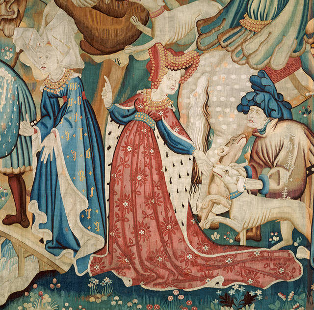
Do you have a favourite memory of the V&A? Alternatively, do you have a favourite object in the Museum?
The V&A is such an inspiring place, it’s almost impossible to choose a single object. I find the room with the Devonshire Hunting tapestries absolutely stunning. I love looking at the figures – the details in the garments, the patterns in the clothes and depiction of vegetation. The first time I visited the museum, I spent hours in that room.
And lastly, do you have any interesting projects coming up and where can we see more of your work?
Some exciting projects are in the making, although I cannot give any specific details at the moment. More of my work can be found at my website, and also on Instagram, where I regularly post updates on my work.
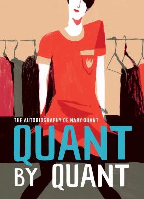
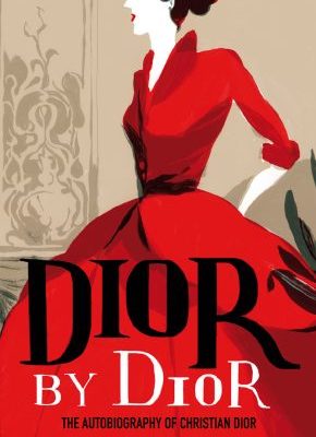


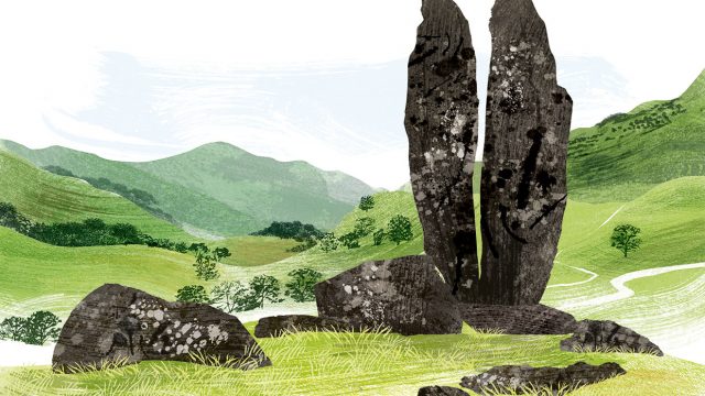
A common element to all the covers is that they all depict an emblematic garment by each designer
Great! thanks for publishing this wonderful article about the illustrating autobiographies. It is indeed a great way to showcase one’s life in an artistic way!
Kudos for having me here!
Great! thanks for publishing this wonderful article about the illustrating autobiographies. It is indeed a great way to showcase one’s life in an artistic way
Download here