It’s been a fantastically busy and exciting year at the V&A; the Museum’s immense creativity and reach has continued to flourish and grow. The wealth of remarkable ideas and objects found here at the V&A are embedded across everything we do. From our architecture, exhibitions and events, to our publications, retail and digital media, each element is an important part of our story.
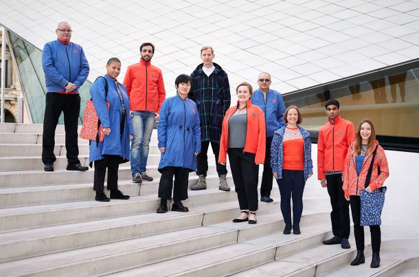
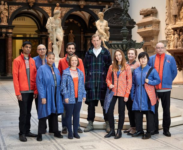
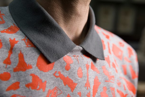
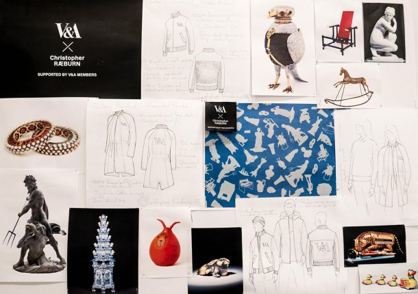
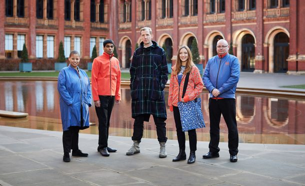
The V&A’s staff are integral to our purpose, and front of house staff are at the heart of this communication. Our superb Visitor Experience teams bring our brand to life – and in an exciting development – we are delighted to have worked with award-winning British fashion designer Christopher Raeburn on brilliant, new uniforms for our gallery assistants, retail staff and volunteers. These garments and accessories are colourful, practical and adaptable, whilst connecting with our foundational purpose in inspiring contemporary designers. Christopher focused on iconic objects from the V&A’s collections – from Japanese netsuke and a 1970s Spacehopper, to Bernini sculpture and an 1870s rocking horse – to design a print from their silhouettes. Importantly, Raeburn’s ethos of responsible design has also ensured that certified recycled and organic materials were used throughout. Our new uniforms ingeniously reflect the V&A’s distinctive spirit of creativity and imagination.
Our team asked Christopher how he approached working with the team and the museum.
V&A: You are probably now the designer with the most pieces in the Victoria and Albert Museum, but do you have work in the collection as well as on the gallery assistants?
Christopher Raeburn: It’s been a real honour to design a uniform for the V&A staff. We’re also really proud to announce that we’ll be exhibiting a look from our iconic REMADE Silk Map collection at the V&A’s ‘Fashioned from Nature’ exhibition early next year.
V&A: How did you go about designing the new uniform?
CR: The first thing we did was to sit down with the team and have a discussion; we felt it was really important to understand their needs – and their working environment over the seasons.
We worked closely with the V&A as we developed the collection and many feedback sessions to refine the uniform. We also felt using a vibrant colour palette was important but, ultimately, we wanted to draw as much inspiration from the museum’s collection as possible; especially through the print itselft, and the iconic objects from the Museum that feature within it.
V&A: How important is it to design to specific needs?
CR: Considered design is the core of what we do. Understanding what everyone needs to do the best job they can – from the front-of-house teams to the volunteers – was a vital part of the design process.
V&A: Did you have any concerns when you started working on the project? Did they change over time?
CR: The opportunity to responsibly design uniforms for such an incredible institution comes with an obligation to do things properly and in a considered way!
One of the challenges was around the fluctuation in temperature in the galleries. We needed to develop a carefully considered layering system to work across a range of temperatures and reflect the needs of different staff throughout the Museum.
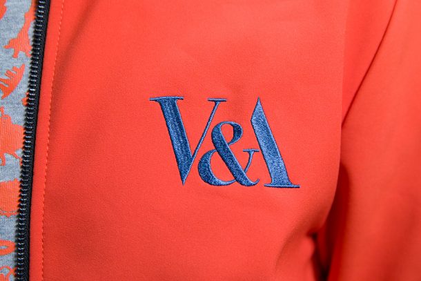
V&A: You place a strong emphasis on sustainable fashion – are any of the pieces for the V&A uniform made from recycled or upcycled material?
CR: Yes, all pieces have been designed and developed responsibly with a focus on certified recycled and organic materials throughout.
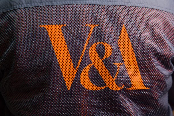
V&A: How did you choose the textiles that make up the garments?
CR: The materials were very much chosen in line with our company ethos. Everything we do as a business is underpinned by the three ‘Rs’: Remade, Reduced and Recycled. From using recycled materials for the outerwear, to organic cottons for the jersey.
V&A: Would you wear it yourself?
CR: Absolutely! A lot of the pieces have been refined from classic Raeburn designs such as the mesh bomber jacket and rainproof parka. It’s been a real honour to develop those pieces further to meet the needs of the V&A.

The V&A is my favourite museum. I love you and have been a member for a very long time. However, this is bad.
You are the V&A, not an ice-skating centre. Everything is wrong with these:
– lack of style
– looks cheap, as if bought at an outdoor shop
– unflattering for pretty much every body type
– utterly inappropriate for an institution like the V&A
– hard to identify as staff uniforms, look like tourists’ clothes
What on earth was the brief? If you want fleece and other “practical” fabrics, cut it classically like a blazer to make it look more upscale and use conservative colours. Did you consult staff and visitors on this? Or were you going for the big surprise…
I don’t think I’ve ever seen anything so hideous and cheap looking outside of a pound shop. Emperors new clothes come to mind and this is in the best museum of art and design in the world. Shame on the designer and the deluded management that accepted such tat.
The range of uniform is great, and it’s not something that I’ve see done before.
I like the way the uniform is unique to the V&A; it’s approachable and identifiable at the same time.
The orange and blue work well together.
What a shame, the uniform looks dreadful and a waste of time and money. I would reverse the decision now save any more embarrassment and stop production of any more uniform.I hope the staff have their old stuff to change back in to. Poor staff having to dress like that, its not their fault and I hope they don’t get any stick from the public .
Theme park guide? 6 flags magic mountain? Please. U can do better. U are V&A…
Even Easy Jet knew to ditch this dreary dated look five years ago.
The new outfits look utter crap. I just hope you didn’t pay the idiot much money for this rubbish. My 6 year old daughter could have done better. What a disgrace but sadly standard for London museums these days
Thanks for your comments on our new uniforms, we really value your feedback. Christopher Raeburn designed these with a focus on staff’s needs. V&A staff gave written feedback, visited the design studio and were shadowed by the design team to ensure the uniforms responded to their requirements, for example the layering system that works across temperatures.
All the materials used are certified organic or recycled; many of these garments started out as plastic bottles. The print and colour draw inspiration from our collection. The garments are designed to work for our many different staff, like our wonderful gallery assistants pictured alongside Christopher here!
Please tell me this is a spoof!
I’m afraid I think they are dreadful to say the least.
As others have suggested they look like supermarket uniforms not at all like what you would expect a prestigious museum would condone.
V&A you have really let yourselves down with this set of ‘designs.’ What on earth were you thinking? Your designer is either having a laugh or ought to be ashamed of himself for producing such a lot of talentless rubbish. Ok for a walking that couldn’t find anything better to wear, but they diminish the V&A and make me question your wisdom as management.
Surely this post was meant for April Fools day! Words fail me.
Many of the comments already listed speak for themselves, and are extremely felt in the extreme. However, an aspect of the uniforms that is doubtful, when a comparative study is made in situ with the exhibits in the V&A’s collection as seen in the galleries, and not mentioned yet, is colour collision ! Many of the galleries have a neutral and subdued colour structure, giving the individual items a chance to shine in their own right. The bright red colouring of the proposed uniform will utterly distort this successful gallery code, and draw undue attention to it and its wearer? Why? It is not needed and will distort the visitors’ visual acumen. At the moment the neutral colouring of the museum’s staff uniforms complements the elegance of the collections and that of the building itself by not getting in the way. Why should any designer consider themselves to be above these standards by creating uniforms that are an’ intervention’? An ‘intervention’ of what?
IKEA, B&Q, petrol station…….
:(
I had no idea the V&A employed Antarctic cruise guides in its exhibits.
Whilst I applaud Christopher Raeburn’s ethos in developing clothing that is both ethical and sustainable, I think the overall look of the uniforms does not serve the V & A appropriately.
When designing uniforms it’s essential to take into account staff needs and requirements as you have inferred, but this needs to meld with an aesthetic fitting with the venue and the purpose of the staff, which is to assist visitors in their ‘art’ experience.
The present outfits although modern are overbearing, look unprofessional and detract from the overall experience one would expect when visiting one of London’s most iconic venues. Sadly, this is a missed opportunity to demonstrate how practical British design can shine on a world stage and champion people and the planet.
Our new uniforms ingeniously reflect the V&As position as the Burger King of world museums…
Oh Lordy!!!! what more can be said than what has already been said!!!! in my opinion they are awful, yes its great to use recycled items that have been turned into fabric but, the staff look like they have just come out of a recycle centre??? really really disappointed! why does ‘being upto date’ have to be something weird? classy, smart, yes, I am proud to work here & you can ask me to help!! needs to be the theme please!!!!
I like the uniform because it’s progressive and contemporary. Breaking out from the norm is what creativity is about. It’s courageous to have a boldly different look. From afar the tops look like leopard print however look closely and they display pieces and artefacts from the museum collection which is very thoughtful as well as gender neutral and LGBTQ inclusive. The layering is practical and by breaking the tradition of suits / blazers what people may expect speaks to modernity and approachability than elitist members institution of bygone eras. The look is pushing the boundaries and is therefore making people understandably uncomfortable which I think is typical of evolving creativity. As with many historical innovations that were laughed at at launch, I feel having visited the Diva exhibition the look will prove to be later celebrated for being bold, daring, pioneering and courageous to take the idea of uniform re imagined for the future. I’m probably going to be condemned for my personal opinion however I choose to take the alternative norm bending approach as you have with the uniform. Applause to the team and volunteers makimg the visit special whatever they are wearing! They have gone above and beyond during every visit to date.
@Dyla But this isn’t creative or innovative. You can get all these clothes in your nearest Mountain Warehouse. I am suprised no one was put in joggers. This is the opposite of creativity and style.