Gitta Gschwendtner was the Exhibition designer for The Fabric of India, and worked with the V&A’s team over the past two years to design the delivery of the show. Gitta’s immersive design was integral to the show, and received rave reviews by industry professionals and visitors alike. She now takes a moment to reflect on her work.

It has been an absolute pleasure to work on the exhibition design for The Fabric of India.
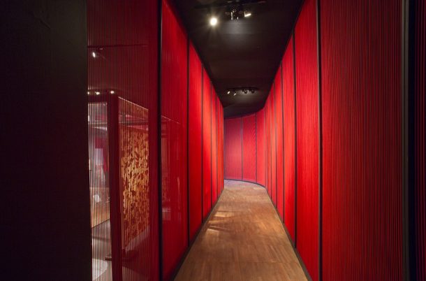
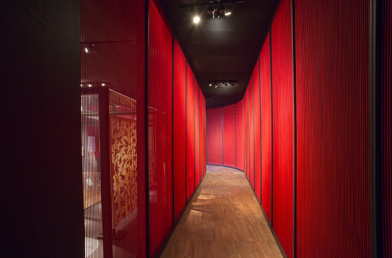
One of the main exhibition design concepts was the use of string, inspired by thread on a loom. At the entrance a dramatic installation had red bungee projecting from the title font. Further along a red bungee corridor connected two galleries, creating a stunning passage that allowed glimpses through the string into the adjoining space. In the final gallery blue bungee was used to create a screen separating two fashion sections. The vertical string changed its opacity depending on the viewing angle, creating changing transparency as well as different intensities of the blue.
To create further continuity between sections, my design used trays to display objects, create walls and plinths. The tray developed into a design language that was subtle, yet recognizable, creating containers, frames and parameters.
In order to distinguish the diverse themes of the exhibition each section employed a different pallet of rich materials and colours. In the first section, “Nature and Making”, plain mdf created the backdrop for a display based on basic workshop environments. In the “Sacred” section aged copper and copper coloured walls alluded to temples, churches and mosques. Further along “Splendid” explored the magnificent architecture of palaces through yellow stained mdf and sky blue lighting. In “A Global Trade” a dark environment with bright red case interiors recreated the mystery of foreign trade routes. The section “Textile in a Changing World” used grey stained mdf to bring a more contemporary feel to the exhibition, referencing concrete and also introducing fins into the tray structure. The final section, “Cutting Edge”, used an even darker stained mdf in combination with aged zinc, creating tray catwalks for the fashion mannequins.
As a record of the show I have produced a short film that highlights some of the themes described. Enjoy!

I am so sorry to have missed the Exhibit. Will it be travelling to North America?